ASCENT
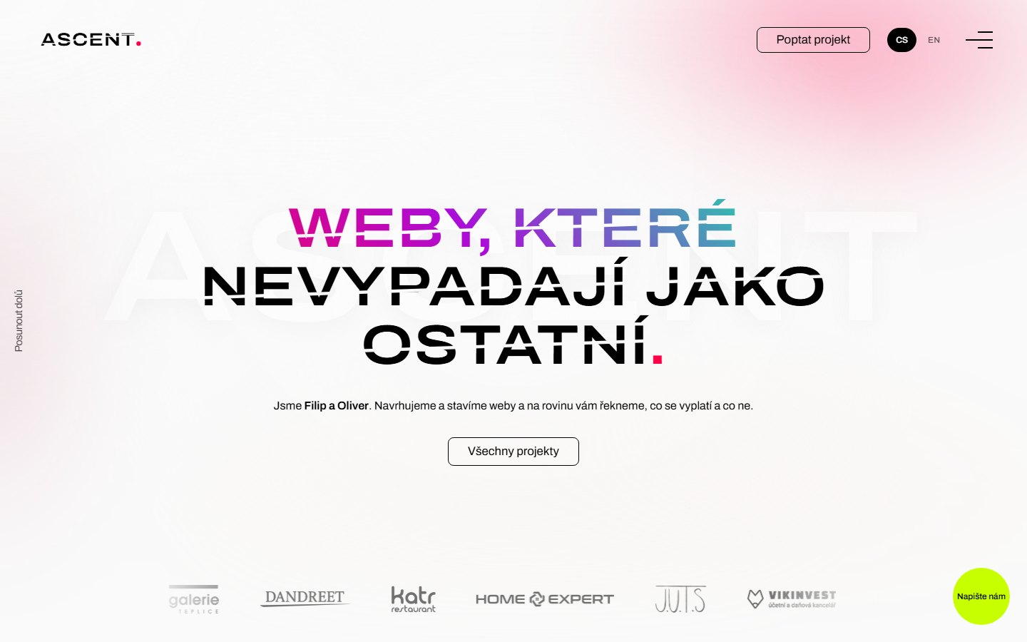
Our own brand and website, where the rising cut from the logo runs through every heading.
- Client
- ASCENT
- What we did
- Brand and identity, Custom websites
- Website
- ascent.cz
The brief
ASCENT is our own studio. There are two of us, Filip and Oliver, and we used to work under the name Website Visuals. A new name meant a new brand and a new website, and this time we were our own client.
Anyone thinking of working with us will judge what we can do by this site, so it had to hold up as well as anything we make for clients. You won’t find results or figures here: it’s our own brand and website.
The solution
An ascent is a climb, and we built that straight into the logo. The wordmark is ASCENT set in Archivo, semibold and extra wide at 118% of its normal width. A stepped cut rises through the letters from left to right, and a red dot, #fe0048, follows the word. For the favicon the logo shrinks to a monogram, “A.”, with the same dot.
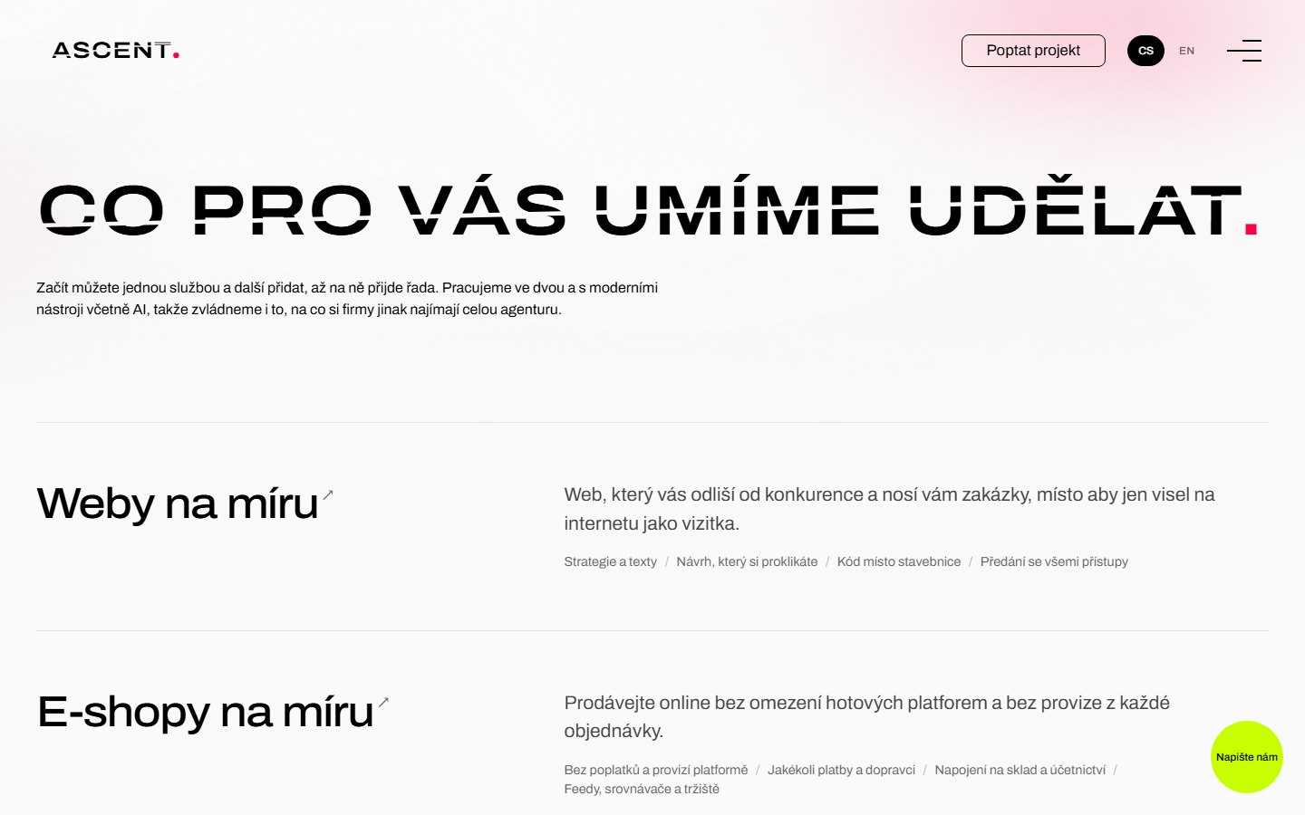
The cut comes back in the headings on every page of the site. Instead of steps, each line of a heading is crossed by one smooth, rising cut. That makes the brand recognisable on any page, even in a screenshot where the logo doesn’t appear at all.
The look
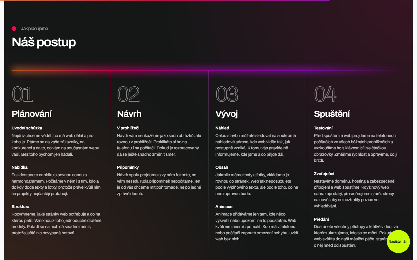
The base is a light #fafafa background with near-black text. Against that sit dark #151717 panels, holding things like our process or the open menu. Red and pink provide the accents, and the brand gradient runs from orange through red to purple. The contact bubble is lime, so it never gets lost on the page.
We treated motion as part of the brand. The homepage opens with red smoke laced with soft dark streaks, a WebGL simulation running right in the browser. A glow follows the mouse across the dark process panel. A custom cursor recolours whatever sits beneath it and shows a service’s name when you hover over it. And a thin line in the gradient colours along the top of the page shows how far you’ve read.
The details
We wrote the site by hand in PHP, with no site builder and no CMS. Only the two of us ever change the content, so it doesn’t need an admin panel. Everything is in both Czech and English, and the quote form is split into several steps, so nobody has to wade through one long list of fields.
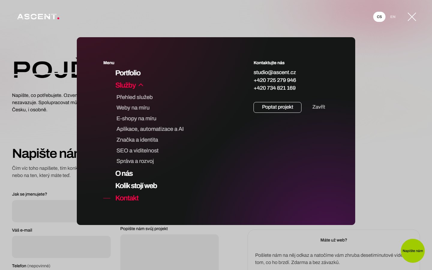
Case studies are shown inside a browser window, so you see a client’s site the way its visitors do. The menu opens as a dark panel with rounded corners, where the services expand into a list of their own. And since you’re reading this case study on the very site it describes, you can try out everything in it right now.