Stryve Hydration
A creatine drink whose site is there to sell the product, not to explain the brand.
- Client
- Stryve Hydration
- What we did
- Custom websites, Custom online shops
- Website
- stryvehydration.com
The brief
STRYVE is a creatine energy drink. People who buy it make up their minds quickly, usually on a phone, so there’s no time for a long introduction.
All the site needs to do is show the product, say what it’s for and get the visitor to buy. Anything else just slows them down.
The solution
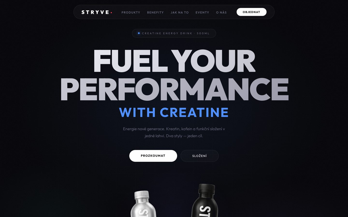
The dark opening screen carries a single line, FUEL YOUR PERFORMANCE, with two buttons right below it. Both variants of the product are visible side by side from the start, so people are choosing before they’ve read anything.
The dark background is deliberate. A silver bottle and a black one would lose their contrast on a light background, and they’re exactly what people should remember first. The site is in English because the brand isn’t aimed only at the Czech market.
The look
We kept the site almost entirely to black, grey and white. The only colour is the blue of the word creatine and the small labels above each section, plus the red dot from the logo. That way the blue shows the reader at a glance what matters.
Headlines are set in a heavy, wide sans serif that fills almost the full width of the screen. Small labels with generous letter spacing look technical, like the tag on a piece of training kit. Anyone who buys creatine goes to the gym and knows this style well.
The details
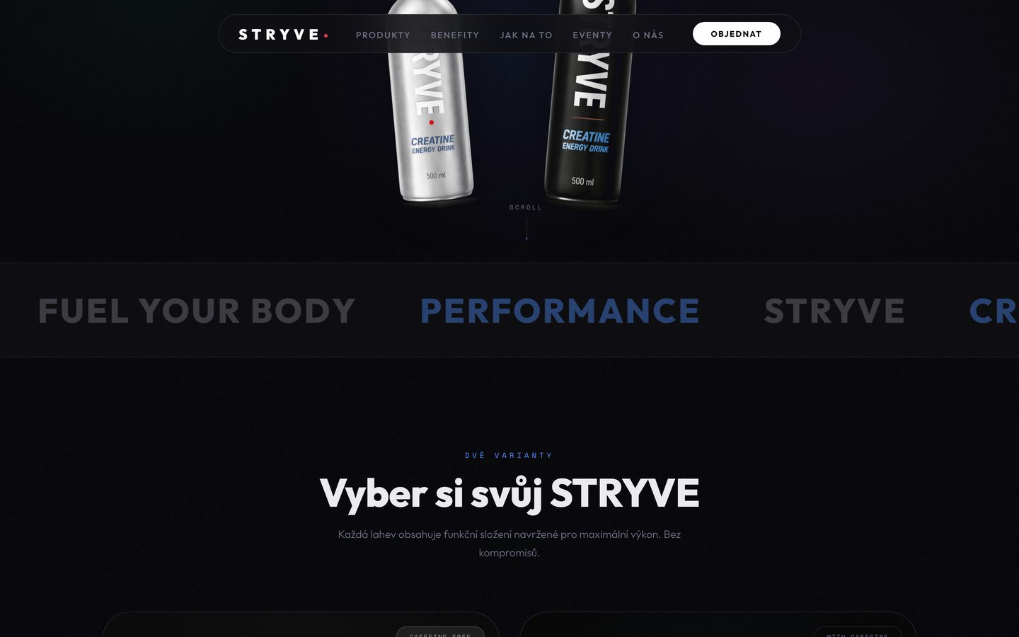
The navigation sits in a floating bar at the top, with a white Order button on the right wherever you are on the page. After the opening screen comes a band of slogans that separates the first impression from the product choice and sets the pace of the page.
Each variant has its own card, one caffeine-free and one with caffeine, so people choose by when they want to drink it rather than by reading a complicated description. The how-to and events sections come after the product, for anyone who wants to know more. The bar and its Order button stay at the top on a phone too, because that’s where most buying decisions are made.